


Corporate Identity Design: Components, Process and Digital Use
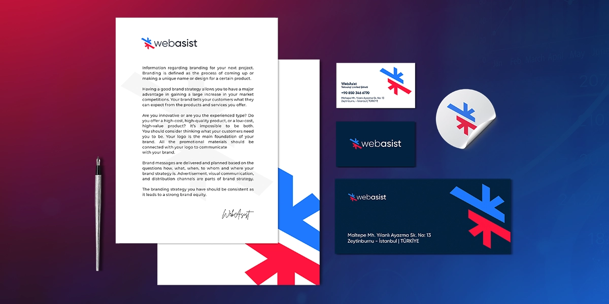
People recognise a business by how it looks long before they read a word: the colours on its website, the typeface on a business card, the feel of its social media posts. Corporate identity design makes sure those impressions are planned and consistent instead of accidental.
In short, corporate identity design is the strategic and creative process of turning who an organisation is, what it stands for and how it speaks into one coherent system of logo, colour palette, typography, visual language and tone of voice, with the rules for using that system recorded in a brand guidelines document.
This guide covers the building blocks of a corporate identity, the steps of the design process, the print and digital materials you will need, and how identity carries over to your website, social media and advertising.
Corporate Identity vs Brand Identity vs Corporate Image
These three terms are often used interchangeably, but they describe different things:
- Corporate identity: how the organisation expresses itself. Logo, colours, typefaces, documents, language and even the way employees talk to customers all fall within it. Its audience is not only customers but also employees, partners, suppliers and investors.
- Brand identity: the customer-facing personality of a specific product or service brand. In a single-brand business it largely overlaps with corporate identity; a company with several brands may give each one its own identity.
- Corporate image: how people actually perceive you. Image cannot be designed directly; it forms over time through a consistent identity and behaviour that matches it.
That is why a corporate identity project is not just a design job. It is a series of decisions about how the organisation wants to present itself, and the visual elements are those decisions made tangible.
Why Corporate Identity Matters
- Recognition: when people see the same colours, typefaces and visual style again and again, they start to recognise you before they read your name.
- Trust: a business whose website, proposals and social media all look different leaves a scattered impression. Consistency signals professionalism.
- Speed and efficiency: a team with clear templates and rules does not have to debate design from scratch for every presentation or ad.
- Differentiation: if you use the same shade of blue and the same stock icons as your competitors, customers will mix you up. Identity work studies your sector's visual conventions and decides where you stand among them.
- Alignment across teams and agencies: new designers, agencies and employees can apply the brand correctly from day one by following the guidelines.
The Core Components of a Corporate Identity
A strong corporate identity rests on six building blocks: the logo system, colour palette, typography, visual language, brand voice and the brand guidelines that tie them together. They depend on each other, so a change to one usually means reviewing the others.
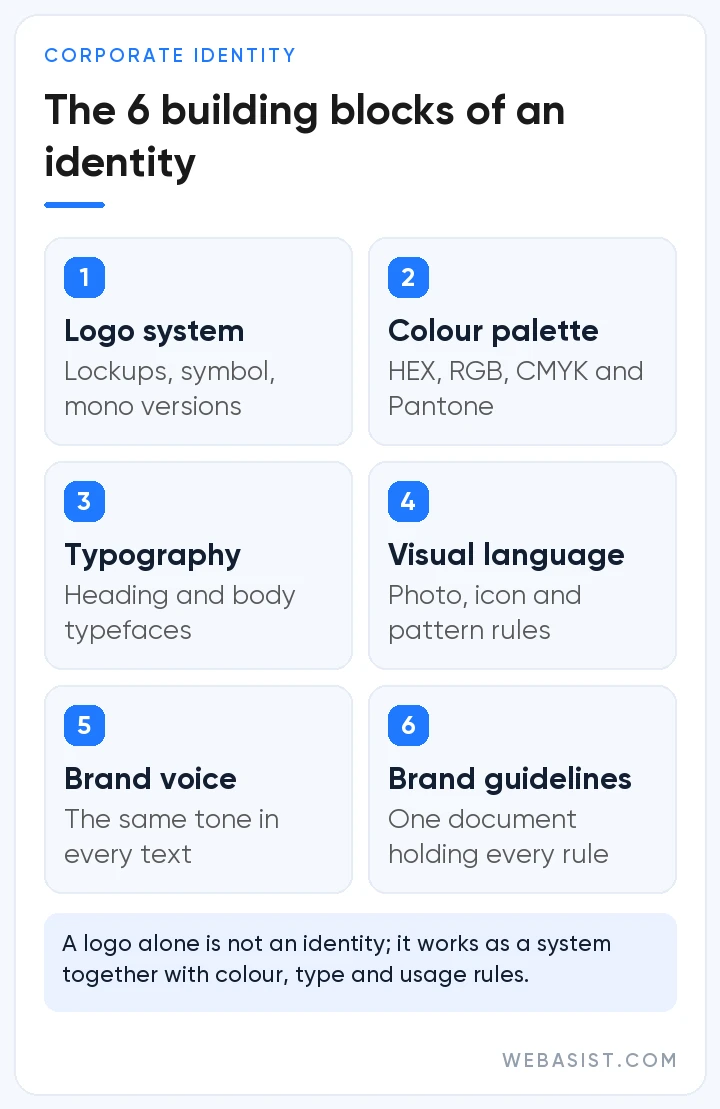
Logo and logo system
The logo is the most visible part of an identity, but on its own it is not enough. A professional identity delivers the logo as a system:
- Horizontal and stacked (or square) lockups
- A symbol-only version for favicons, app icons and profile pictures
- Versions for light and dark backgrounds, plus a single-colour version
- Clear space rules and a minimum size
- Vector (SVG, PDF, EPS) and raster (PNG, JPG) file formats
Design for the smallest use case first. Fine details that vanish in a browser tab icon a few millimetres wide will cause problems, however impressive they look on a large screen.
Colour palette
A corporate palette usually consists of one or two primary colours, supporting accent colours and neutral tones for text and backgrounds. The guidelines should list each colour's HEX and RGB values for screens and CMYK (and, where needed, Pantone) values for print; otherwise the same red will look different on your website and in a printed brochure.
On screen, legibility is a design requirement too. At Level AA, the W3C's WCAG 2.2 accessibility guidelines call for a contrast ratio of at least 4.5:1 between normal-size text and its background, and at least 3:1 for large text (18pt, or 14pt bold). Text that is part of a logo or brand name is exempt, but building the palette with these ratios in mind means your brand colours can also be used for buttons and text.
Typography
Typography is the visual counterpart of your tone of voice. Most identities pair one typeface for headings with one for body text and define sizes, line spacing and emphasis rules. If you communicate in more than one language, check that the typeface fully supports every character you need; for Turkish, for example, letters such as ğ, ş, ı and İ. Licensing matters as well: confirm that the font may be used on the web, in apps and in print. Defining a fallback font for when the main one fails to load keeps your website and email templates consistent.
Visual language
Photography style (natural light or studio), illustration and icon sets, graphic patterns, corner radii and layout rules make up a brand's visual language. When these are left undefined, every designer follows their own taste and the identity gradually falls apart.
Brand voice and tone
Corporate identity is not only visual. Whether you sound formal or friendly, which words you favour and which you avoid are all part of it. Keeping the same tone from website copy to customer service replies matters as much as visual consistency.
Brand guidelines
Brand guidelines (also called a brand book or style guide) bring all of these decisions together in one place. A typical guide covers:
- Mission, values and brand personality
- Logo usage rules and examples of incorrect use
- Colour codes and how much of each colour to use
- Typefaces and typographic hierarchy
- Rules for photography, icons and illustration
- Tone of voice with sample copy
- Print and digital templates
Guidelines are only as good as they are usable. A digital page or shared folder where the current version is easy to find works far better than old PDFs circulating by email.
How to Create a Corporate Identity: Step by Step
A good identity project starts with questions rather than sketches, and each step builds on the output of the one before. Whether you are creating a new identity or refreshing an existing one, the work usually follows these seven steps:
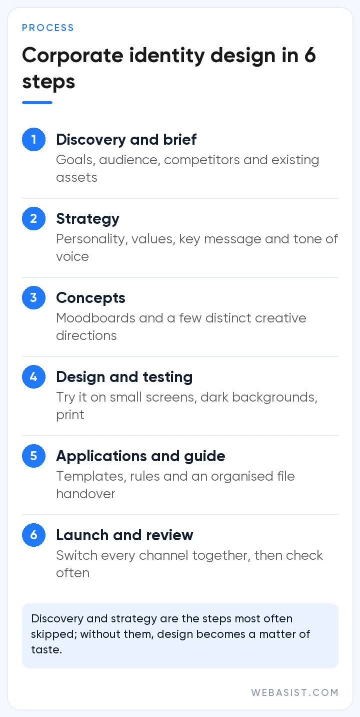
- Discovery and brief: review the organisation's goals, audience, competitors and existing materials, and take an inventory of the current logo, documents, website and social accounts.
- Strategy and positioning: define the brand personality, values, key message and tone of voice, and write down what feeling the design should create.
- Concept development: prepare moodboards and a few distinct creative directions, then choose one with the decision makers.
- Design and testing: develop the logo system, palette and typography, and test them in real conditions: on small screens, on dark backgrounds, in black-and-white print and inside a social media profile frame.
- Applications: produce priority items such as business cards, letterhead, presentation and proposal templates, email signatures, social media templates and the web interface.
- Guidelines and file handover: document the rules and deliver every file in the right formats with a clear folder structure.
- Launch and review: roll out the new identity across all channels at the same time, check consistency at regular intervals and update the guidelines as new needs arise.
The first two steps are the ones most often skipped. Design without strategy turns into a matter of personal taste and tends to be reopened for debate within a few years.
Print and Digital Applications: What to Prepare
| Area | Typical applications |
|---|---|
| Business stationery | Business cards, letterhead, envelopes, folders, invoice and proposal templates |
| Sales and marketing | Presentation template, catalogue, brochure, trade show stand, promotional items |
| Digital channels | Website interface, favicon, email signature, social media profile and cover images, post and story templates, ad creatives |
| Video | Intro and outro animations, subtitle and title styles, thumbnail templates |
| Physical spaces | Signage, office wayfinding, vehicle graphics, packaging, staff uniforms |
Not every business needs the whole list. Prioritise the touchpoints where customers meet you most often, and today many of those are digital.
Corporate Identity and Your Digital Presence
Corporate identity used to start with a business card and a shop sign. Today many customers first meet a brand in a search result, a social post or an ad, so digital use should be a design criterion from the very beginning.
Website
Your website is the most complete expression of your identity. The palette becomes buttons and links, typography becomes the heading hierarchy, and the visual language shapes photos and icons. For the identity to work on the site, its rules need to be built into the page templates, which is why running your website design project alongside the brand guidelines saves time. Do not forget the site icon shown in search results either: Google recommends a square (1:1) favicon larger than 48x48 pixels.
Social media
On social media, identity lives in profile pictures, cover images, post and story templates, colour use and writing style. Each platform has its own image dimensions, so templates should follow each platform's current recommendations. A planned setup such as our social media management packages makes it easier to publish consistently and stay on brand.
Advertising and video
When ad creatives use the same colours, typefaces and visual language, people can recognise the ad before they read the brand name. In video, intro and outro animations, subtitle styles and colour grading are the moving version of your identity, and these rules should be settled at the start of any video production project.
Common Corporate Identity Mistakes
- Treating the logo as the whole identity: without colour, type and usage rules around it, a logo soon gets applied in many inconsistent ways.
- Designing for trends: this year's fashionable style will look dated in a few years. A lasting identity rests on the brand's character rather than on trends.
- Leaving digital until last: a logo with fine lines may look elegant in print and be illegible on a small screen.
- Writing guidelines and forgetting them: a guide that is never updated or shared quickly becomes a file nobody opens.
- Ignoring licences: fonts or images used without the proper rights can lead to legal problems later.
Corporate Identity Handover Checklist
A missing file or an unclear usage right can cost you time later, when you work with a new designer or printer. Before you sign off the project, make sure that:
- every logo version is supplied as vector (SVG, PDF or EPS) and raster (PNG) files;
- the guidelines list HEX, RGB and CMYK values for each colour, plus Pantone where needed;
- the typefaces, their licence types and the terms for web, app and print use are documented;
- business card, presentation and social media templates come with editable source files;
- the current version of the guidelines lives in one place your team and partners can easily reach;
- usage and ownership rights for the designs are set out in writing in your contract.
What Determines Cost and Timeline?
There is no single price or timeline for a corporate identity project. It depends on:
- Scope: just a logo and basic stationery, or strategy, guidelines and a wide set of applications?
- Research depth: whether market and competitor analysis or stakeholder interviews are included
- Concepts and revisions: how many creative directions and feedback rounds are planned
- Number of applications: the range of print and digital materials to produce
- Starting point: a brand-new identity or a refresh of an existing one
- Decision making: the more people involved in approvals, the longer the schedule
Frequently Asked Questions
What does a corporate identity include?
At its core, it includes a logo system, colour palette, typography, visual language, tone of voice and brand guidelines that explain how to use them. Most projects also cover applications such as business cards, letterhead, presentation templates, email signatures and social media templates.
Is corporate identity the same as logo design?
No. The logo is only one component of a corporate identity. The identity is the full set of elements used with the logo, including colours, typefaces and visual language, together with the rules for applying them.
How long does a corporate identity project take?
It depends on scope, research depth, the number of revision rounds and how approvals work. A project covering only a logo and basic stationery is very different from one that includes strategy, detailed guidelines and many applications. Agreeing the scope in writing at the start is the best way to get a realistic schedule.
Why do you need brand guidelines?
Guidelines make sure the identity is applied correctly even when the people who designed it are not involved. New employees, designers, printers and agencies all work from the same rules, so the brand looks the same on every channel.
Should I register my logo as a trademark?
It is not mandatory, but registration is the most reliable way to protect your logo and brand name. Applications are filed with your national or regional IP office; in Türkiye, that is the Turkish Patent and Trademark Office. It is also wise to check during the design process that your chosen name and logo are not similar to existing registered marks.
How often should a corporate identity be updated?
There is no fixed rule. A refresh becomes relevant when your audience or business model changes, when the identity does not work well in digital channels, or when it no longer stands out from competitors. In most cases, an evolutionary refresh that keeps the recognisable elements is less risky than starting over.
Conclusion
Corporate identity design is about much more than making a business look good. It is how you communicate who you are with the same clarity at every touchpoint. A solid strategy, a well-built logo system, controlled use of colour and type, and guidelines everyone can refer to will keep your brand consistent for years.
If you want to plan how your identity is applied consistently across your website, social media and advertising, explore WebAsist's project consulting and management service or tell us what you need through our contact page.