


Corporate Identity Design: What It Is, What It Covers, What Sets the Price
Corporate identity design is the work of designing your logo, colours, typeface and the rules for using them everywhere from a business card to your website as one system, and writing that system down in a guide. The logo is only one part of it. Scope sets the price: a job that ends with three logo options and a job that ends with strategy, guidelines and templates are not the same thing and do not cost the same.
We look at this not as a design studio but as an agency that builds websites and runs ads. In most businesses that come to us for a website, the first question we ask is: do you have a vector file of your logo and your colour codes? Most do not; the logo is a JPG a printer once sent, and the colour is "sort of navy". The site, the ad creatives and the social media templates then get argued over from scratch. This article is here to settle that argument in advance.
What is corporate identity and what does it cover?
Corporate identity is the whole of how your business presents itself: logo, colour, typeface, photography style, tone of voice and the rules for using them. Brand identity is the face of a single product or service brand, and in a single-brand business it is the same thing. Corporate image is the picture in other people's heads; you cannot design it directly, you earn it over time with a consistent identity.
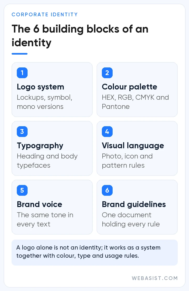
We expect an identity project to deliver six parts; if one is missing, the identity falls apart within months:
- Logo system: Horizontal and stacked lockups, symbol only, versions for light and dark backgrounds, a single-colour version, clear space and minimum size. Files as vector (SVG, PDF, EPS) and PNG.
- Colour palette: One or two primary colours, supporting colours and neutrals, each with HEX and RGB for screens, CMYK for print and Pantone where needed. Without codes, the red on your website and the red on your brochure will not match.
- Typography: Typefaces for headings and body text, size and emphasis rules. For Turkish a must: the font has to render ğ, ş, ı and İ properly, and the licence for web, app and print has to be in your name.
- Visual language: Photography style, icon set, patterns and rules such as corner radius. If these are not written down, every designer applies their own taste.
- Brand voice: Formal or friendly, which words you use and which you avoid; the same tone from web copy to a WhatsApp reply.
- Brand guidelines: The rules for all of the above, examples of wrong use and templates in one document. Not an old PDF circulating by email but one place where everyone finds the current version.
Logo or corporate identity? The difference is money you pay later
We understand the business that says "a logo is enough for us"; on day one it really is. The bill arrives in year two. When a logo is delivered on its own, the sign maker uses their own blue, the printer their own font and the intern running social media their own layout; six months later you have five brands that do not look alike. At that point you either leave it all as it is, or you commission the identity from scratch and reprint the signage, vehicle graphics, business cards and packaging. The reprint usually costs more than the identity work itself.
The second cost we see shows up in digital. A thin-lined logo that looks elegant in print becomes unreadable at 40 pixels on a phone; without a symbol version for the browser tab icon (favicon) and the Instagram profile picture, you end up squashing the logo to fit. Google asks for a square image larger than 48x48 pixels for the site icon shown in search results; with a logo that has no symbol version you cannot even provide that properly.
Our verdict: a logo on its own is enough only for a start-up still testing the business, whose name may yet change. A business that will put up a sign, wrap a vehicle or run ads should commission an identity; otherwise it pays the same money twice.
How is a corporate identity created? Our order of work
A good identity project starts with questions, not sketches. A logo drawn without knowing who you serve, what your competitors look like and where your customer first sees you turns into a contest of personal taste. Our order is this:
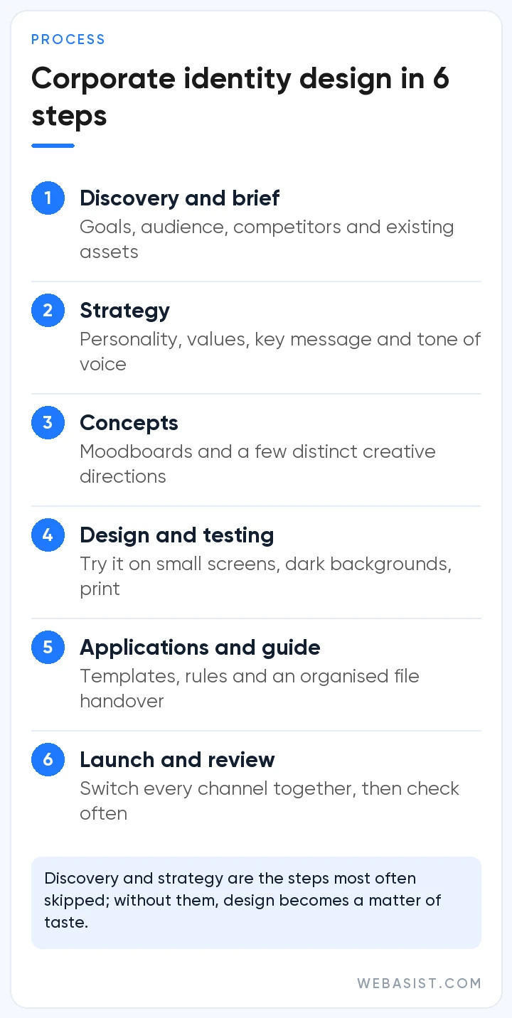
- Discovery: Audience, competitors, existing material. If every competitor is blue, there is no reason for you to be blue too; this is the step where we see that.
- Strategy: Brand personality, key message and tone of voice written on one page. The feeling the design should create is decided here, not at the design desk.
- Design and testing: The logo system, colour and type are developed together and tested on a phone, on a dark background, in black-and-white print and inside an Instagram profile frame. We do not pass a design that is unreadable on a small screen, however good it looks on a large one.
- Guidelines and handover: Rules are written, templates built and files delivered in an orderly folder. The new identity goes live on every channel in the same week; the site is not new while the sign stays old.
The first two steps are the ones most often skipped, because they have no visible output. A logo made without discovery and strategy gets reopened within a year or two with "it does not really suit us".
Corporate identity prices: what makes a quote expensive, and what not to pay for
There is no single market price and we will not invent a range for you. Scope sets the price: is there strategy, how many concepts and revision rounds, are guidelines included, how many applications (business card, presentation, social media template, vehicle, packaging) are produced, and is it from scratch or a refresh of an existing identity. If you have three quotes, put this list side by side before you look at the price; the quote that looks cheap usually leaves out half of the list.
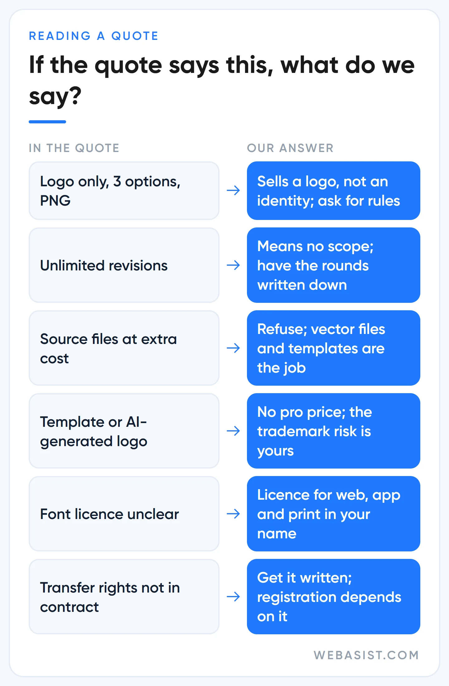
Example scenario, three quotes for the same business: the 7,500 TL quote gives three logo options and a PNG; the 25,000 TL quote gives a logo system, colour and font rules, a business card and a social media template; the 60,000 TL quote adds strategy, guidelines and ten applications. The figures are assumptions, the logic is real: the first sells a logo, the second sells an identity, the third sells the identity being used across the business. For a consultancy with no sign, vehicle or packaging the second is enough; for a retail chain the first is money wasted.
Some things in a quote are not worth paying for. "Unlimited revisions" means no scope; have the number of rounds written down. "Source files at extra cost" should be refused from the start; vector files and editable templates are the work itself. Do not pay a professional price for a logo that came from a template or an AI generator; you carry the risk of the same logo appearing on another business, and the trademark problem that follows.
Our approach: we usually discuss identity work at the start of a website project, because the site is the identity's largest application. Our web design packages include custom interface design; the identity side we quote separately by scope, and there is no identity package listed on our site. You can see the scope on the web design package page.
Does your identity work in digital? A five-minute check
Corporate identity used to start with a business card and a shop sign; today the customer first sees you in a search result, an Instagram ad or a WhatsApp profile. You can tell in five minutes whether the identity you have works in digital:
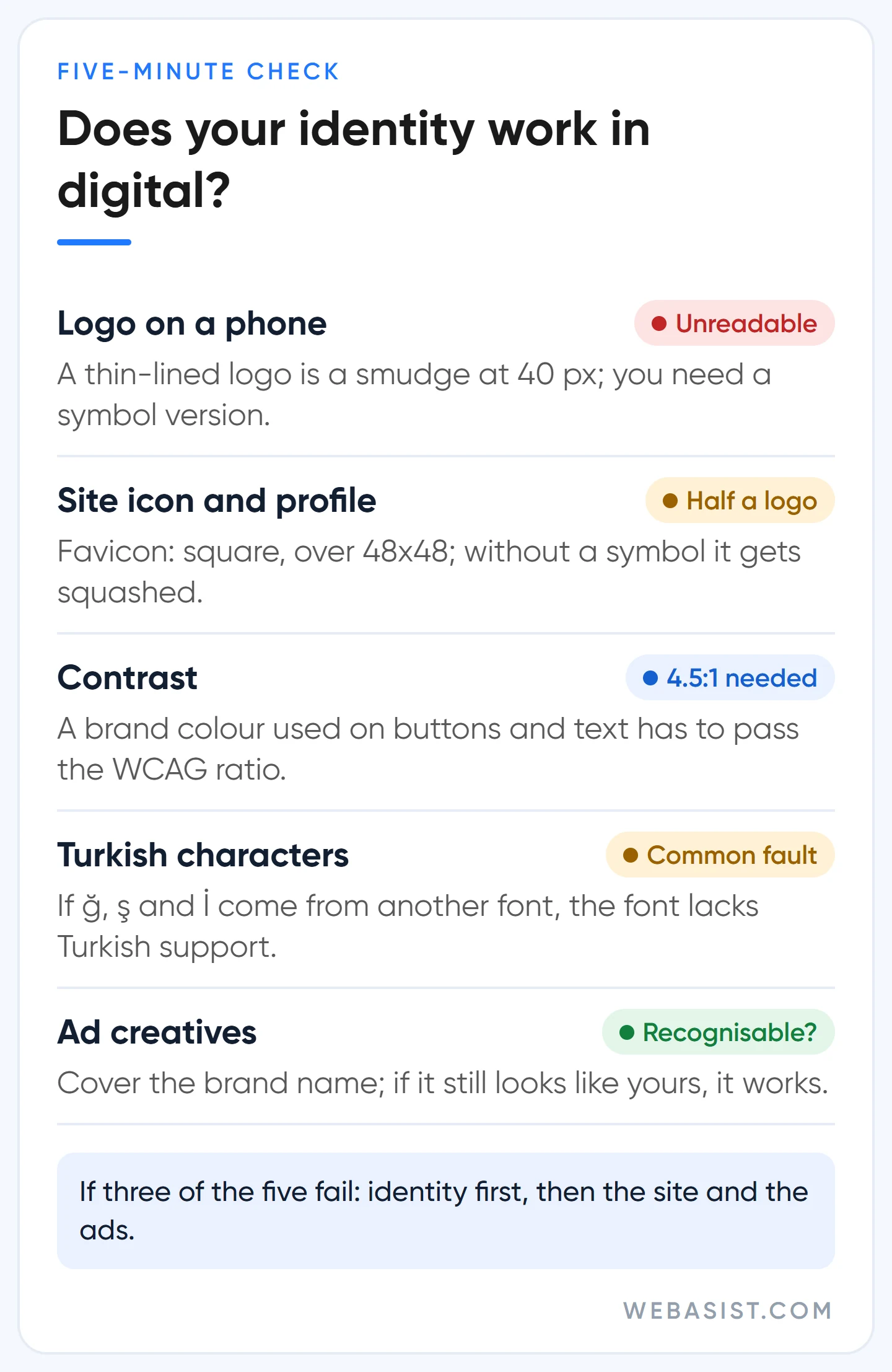
- Logo on a phone: Open your site on a phone. Is the logo readable in the top bar, or is it a squashed smudge?
- Site icon and profile picture: What shows in the browser tab and on your Instagram profile? Without a symbol version the answer is "half the logo".
- Contrast: If you use your brand colour on buttons and text, there is a legibility rule: the W3C's WCAG 2.2 guideline calls for a contrast of at least 4.5:1 between normal text and its background, and 3:1 for large text. White text on light orange fails this test; in that case we do not drop the colour, we add a darker shade for buttons to the guidelines.
- Turkish characters: Do ğ, ş and İ in your site headings come from a different font? A mistake we see very often; the font does not include Turkish characters.
- Ad creatives: Put your last three ads side by side. If you cover the brand name, can you still tell they are yours? If not, every ad is buying recognition from scratch; the image sizes are in our Google ad image sizes article.
If three of the five fail, do not build a site or run ads before renewing the identity; you would only show the same inconsistency to more people. For regular, on-brand social media publishing our social media management package works from the guidelines, as does our video production team for intro and subtitle styles; if there are no guidelines, we draw them up first.
Who is it not for, and when should you not commission it?
- A start-up that has not tested the business yet: While the product, the name and the customer may still change, a 60,000 TL identity is premature. Start with a clean logo and two colours; commission the identity after the first real customers.
- A business whose name is not registered: Before spending on identity, search for similar marks at the Turkish Patent and Trademark Office. Building an identity on a name that clashes with a registered mark is investing in someone else's brand; ask a trademark attorney once about the legal side.
- A recognised but dated identity: If customers know you by your logo, do not start from scratch; ask for a refresh that keeps the recognisable elements. A full redesign wipes out years of recognition.
- A business whose budget does not stretch to the site: If you commission an identity and leave the website on a stock theme, the identity lives only on business cards. Invest first where the customer sees you, which for most businesses is the site and the Business Profile; what comes first is in our landing page article.
Corporate identity handover checklist
A missing file or an unclear usage right surfaces two years later, when you work with a new designer or printer. Before you sign off, the answer to these six questions should be "yes":
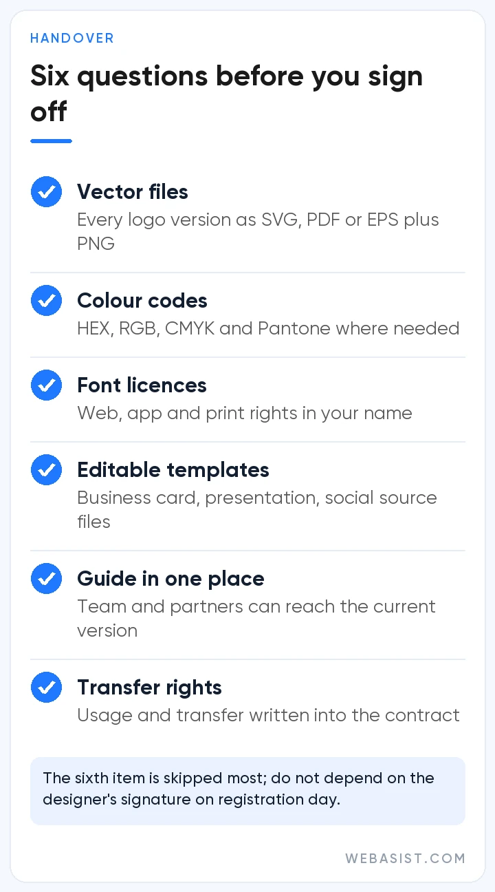
- Are all logo versions delivered as vector (SVG, PDF or EPS) and PNG files?
- Are the HEX, RGB and CMYK values of every colour, plus Pantone where needed, written in the guidelines?
- Are the font names, licence types and usage rights for web, app and print in your name?
- Do the business card, presentation and social media templates come with editable source files?
- Does the current version of the guidelines live in one place your team and partners can reach?
- Are usage and transfer rights for the designs written into the contract?
The sixth item is the one most often skipped. If transfer rights are not in writing, the day you want to register your logo as a trademark you depend on the designer's signature; we have this written into the contract from the start.
Frequently Asked Questions
Is corporate identity the same as logo design?
No. The logo is the most visible part of the identity; the identity is the logo together with colour, type, visual language, voice and the rules for using them. A business that buys only a logo has to make up the rules itself.
How long does a corporate identity project take?
It depends on scope and on the approval process; the more people approve, the longer the schedule. What we see is that the thing that stretches the timeline most is not design but skipping the strategy step, so the taste debate reopens in every round. Fix the scope and the number of rounds in writing at the start.
Where can I see corporate identity examples?
The identity guidelines published by public institutions and universities are good examples, and a search for "brand guidelines pdf" finds many of them. Look at them not for the logo but for how the rules are written: clear space, examples of wrong use, colour codes.
Should I register my logo as a trademark?
It is not mandatory, but registration is the only solid way to protect your name and logo. In Türkiye, applications go to the Turkish Patent and Trademark Office; have a similarity search done before the design is finished.
Conclusion
Corporate identity is not about making your logo prettier; it is about writing the rule for looking the same everywhere. If you will put up a sign, run ads and build a website, do not settle for a logo; if you are still testing the business, do not spend on identity too early.
Send us your logo files and your guidelines if you have them; we will check phone legibility, the site icon, contrast and Turkish characters and put the list of gaps in writing. We do not launch a site or an ad before that list is closed; you can reach us through our contact page.